I began working in digital over ten years ago. Public Wi-Fi was just starting to catch on, and heavy flash-based websites were king. The iPhone had yet to be released and Facebook was still only available to college students. The internet was an exciting frontier, constantly evolving, changing and improving.
And it still is.
I was drawn to this crazy place called the internet because of its continuous innovation and adaptation. Not learning, growing, and adopting new trends? Then you’re already ten steps behind. If design solves problems, then web design solves problems that didn’t exist six months ago with solutions that are being imagined, created and developed in real time.
The web is an exciting place to be.
As we move into 2017, we are once again confronted with a barrage of new novelties, ideas and design solutions for the digital space. So which ones matter enough that they’re actually worth implementing? Let’s take a look at five of the most meaningful web design trends for the new year.
1. Bespoke Illustrations
Iconography and vector illustrations certainly aren’t new to the web, but creating a custom, brand-centric illustration style is. There are tons of great stock visuals out there, but to truly set your site apart, a distinct, one-of-a-kind illustration style is key. Having an in-house designer (or hiring an illustrator) to create couture illustrations is becoming the new norm.
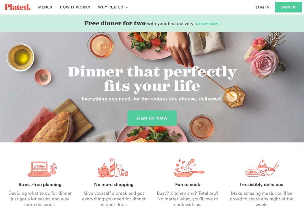
Plated is a beautiful example of bespoke illustrations and iconography that provide helpful visual information while strengthening the brand.
2. Card and grid style interfaces
Personalized experiences with custom content in the form of cards are quickly overtaking the digital space. Think a minimalist design approach with modules displaying helpful chunks of information that allow the user to browse and explore a variety of topics quickly. Pinterest originally made this UI approach popular, but its usefulness and flexibility is quickly spreading across sites of nearly every genre.
Even Google has jumped on the card bandwagon with their Google Now interface.
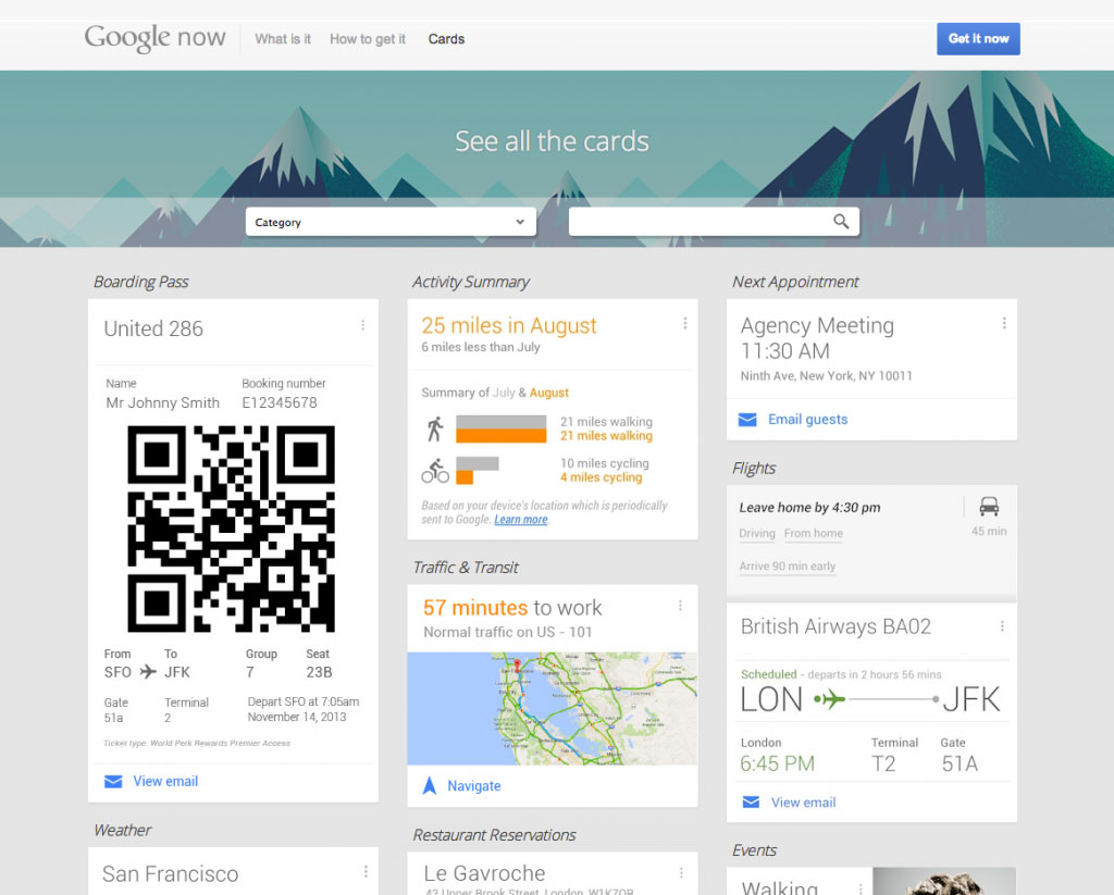
An added benefit to a card-based UI? In addition to being user friendly and intuitive, the stackable, flexible card layout makes responsive and mobile design a breeze.
3. A movement away from “canned” stock imagery toward more authentic photography
Our eyes have learned to recognize stock photography when we see it. Users crave imagery that feels original, legitimate and candid. Photography will always be a mainstay in digital design, but the bar has been raised, and brands are expected to put their best photography foot forward with visuals that feel real and personal.
Looking for amazing photos on a budget? Try Unsplash, which features high-quality imagery that is free, even for commercial use.
4. A focus on Microinteractions
Microinteractions are small interactions between a user and a website that are often completed automatically without much thought. Think “liking” a post or adjusting audio volume on a video or changing a setting on a site.
The design community has a huge opportunity to build trust, increase conversions, and make the user’s experience more pleasant by creating thoughtful microinteractions when designing a site. These small details make all the difference and can prevent user error, while communicating feedback or confirmation to the user each time they complete an action. Want to up your microinteraction game?
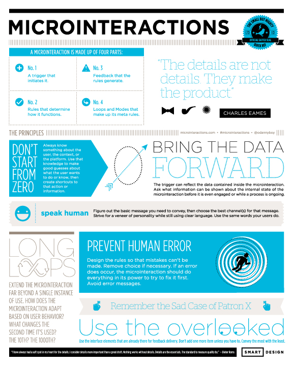
Check out Dan Saffer’s free microinteraction cheat sheet, or visit this site for live examples of meaningfully designed microinteractions.
5. Thoughtful Animations
As the technical capabilities of web browsers and programming languages continue to progress, designers and developers are provided with seemingly limitless animation options that work well on desktop, tablet and mobile devices. But in 2017, animations must be more than just eye catching. A strong animated effect should be simple enough to enhance the user’s experience without being too distracting, while communicating information and providing an element of surprise and delight. Subtlety is key, as overwhelming animations can do more harm than good.
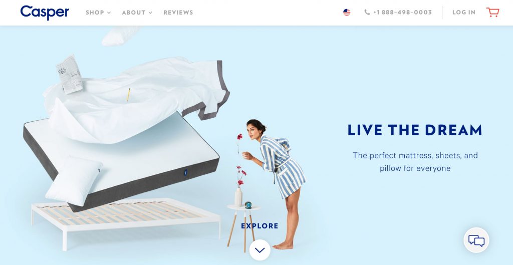
Stop by Casper’s website to see animations that not only make you smile, but provide helpful product information to potential customers.
These are just five trends to try implementing into your 2017 digital design plans. As the internet continues expanding and users refine their visual tastes, web design will be an important realm to keep stretching those creative avenues of information distribution. Interested in juxtaposing your brand? Click here to contact us.
Written by Katrina Taylor || Digital Design Maven

