Every idea or communication starts out as a thought—a message that needs to be communicated to an end user or reader. As designers, it is our job to engage our audience through clear, enticing visual communication.
When designing, it is imperative to decide what is the most important message or point you want to relay. Know your intended audience; then design with them in mind. Decide what is the most important content out of all the messaging. What is the hierarchy? This helps your audience engage quickly with your message and, hopefully, keep their interest.
In today’s world, we are bombarded with media fighting for attention. It is easy to get lost in the shuffle. Capturing and maintaining interest is the most basic goal for any communication, whether it’s a logo design, website, advertisement, brochure, packaging, social profile image, etc. The longer the message the more important it is to provide a clear hierarchy. There are many ways to help draw the eye to your top message: thoughtfully chosen deliberate visuals, typography, color, and negative space.
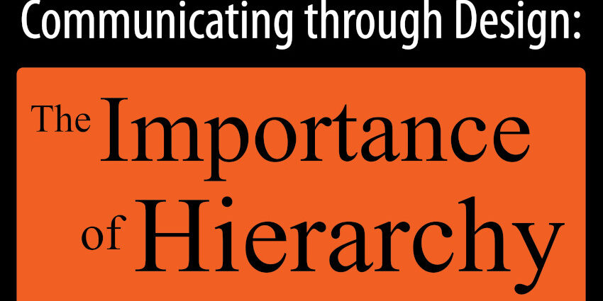
For example, by using a very basic, simple graphic in the title of this blog we have achieved hierarchy in the title: “Communication Through Design: The Importance of Hierarchy.” Through the use of layout position, colors, and fonts we were able to emphasize the end of the title—“The Importance of Hierarchy”— the most important part of the title.
Hierarchy can be achieved very simply, even with a one-color medium like a black and white flyer. Perhaps this instance is when it is most important to use space and fonts to grab and keep the reader’s attention.
With examples ranging from intricate design to understated simplicity, aJuxt is here to ensure your message hierarchy is top of mind.
Written by Natalie Origanti || Graphic Design Guru

