As a business owner it can be overwhelming to know which social media tools are best for your brand. If Instagram is on your radar, you’ve come to the right place. With over 2 billion users monthly, Instagram beat out TikTok for the most downloaded app in Q4 2021. Its continued growth and variety of services makes it an ideal platform for consumer-facing businesses, creators, and organizations seeking millennial and Gen-Z audiences.
The Nitty Gritty
Instagram touts 170 million U.S. users, and according to Pew Research Center, “a majority of adult instagram users in the U.S. say they use the site at least once a day.” In the U.S. 36% are men and 44% are women, 71% are between the ages of 18-29, 48% are ages 30-49, 29% are ages 50-64, and 13% are of the ages 65+.
The Feed
Known for its iconic feed, audiences consume your brand through visuals. The unique grid structure allows the viewer to scroll through a look-book of visuals; think of it as a quilt of square images. It’s important to pick beautiful consistent images that convey your brand through colors, logo, messaging and images that quickly help a customer understand your brand.
The Quilt
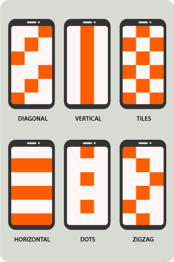
There are many ways to achieve a branded Instagram feed, here are six examples of visually stunning grids.
Diagonal: Create a left to right diagonal grid by posting similar images every fourth post. Use the same background color for a bold diagonal.
Vertical: Starting with the first instance of the column you want to repeat similar images (color, type, etc.) every three posts. This creates a line down the center of your grid.
Tiles or Checkerboard: Post a similar image to every other post to create a checkerboard effect. This is a very easy format to maintain by alternating back forth between two colors, template or content type.
Horizontal: Post three similar photos in a row to create horizontal rows. These can be color centric or content centric. This format is especially good for wide photos divided into three parts.
Dots: Post a similar photo (color, content, style) every sixth post. Try this if you want to highlight only selected photos.
ZigZag: The easiest way to plan this one is visually. Number a 15 tile grid, left to right. Count your first zigzag image as 1, repeat the same type of image for tiles 5, 9, 11, 13, 17, then repeat the pattern. This grid is by far the most complicated and the most restrictive. Make sure you can commit to following this for at least 30-45 images to achieve the full effect.
Overwhelmed?
We know this takes a lot of effort and planning. This is where hiring professionals to help plan and create meaningful, effective posts that successfully convey your brand is paramount. Cue: aJuxt Media Group.
We have 10+ years of experience with helping clients create beautiful, clear, consistent messaging for their brands. Reach out today!
Written by Natalie Origanti || Graphic Design Guru

