Google has announced that Universal Analytics Properties will stop processing data as of July 1, 2023. If you haven’t already, now is the time to switch from Universal Analytics to Google Analytics 4. There are a lot of similarities between Universal and GA4 properties, however, significant layout and terminology differences may make it hard to navigate to the data you grew accustomed to finding easily in a Universal Analytics dashboard. With a growing number of options to reach target audiences, business owners need to embrace utilizing analytics to decide what tools are effective at reaching their specific purchasing audiences. As you know, here at aJuxt, no marketing or content decisions are made until we review the data.
Universal used measurement based on sessions and pageviews whereas GA4 uses a measurement model based on events and parameters. While there are some new definitions and reports to get used to, the data does a much deeper dive and provides significantly more information than before. GA4 promises to be a solid platform to assist business owners in making informed solutions. So roll up your sleeves and dive into the content below!
How to Find Your Top Content — Step-by-step Instructions to Get You Started!
Please note: This guide is for use within a Google Analytics 4 property and will not cover the switch from Universal Analytics to GA4. Here is a guide on how to make the switch.
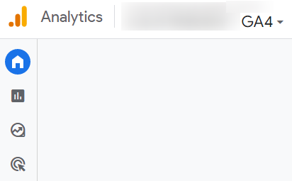
Let’s keep this simple. Begin finding your top content by logging into your Google Analytics account. Then, using the top menu, choose the GA4 property you want to pull data from. Once the property you want to analyze is selected, there is a left sidebar with different icons.

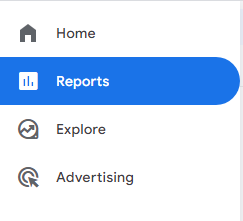
Most business owners logging in to check analytics have a common goal of determining which content on a website is performing the best. If you fit this description we need to click on the “Reports” icon:

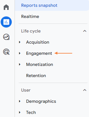
Once you’ve opened the secondary sidebar for reports, click on “Engagement”

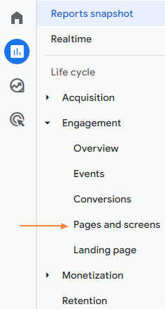
and Then “Pages and screens.”

Scroll down on the “Pages and screens” page until you see a table like this one:

In the above image, the column titles are slightly different from what was mentioned in the original blog post. Instead of pageviews, unique pageviews, average time on page and bounce rate, GA4’s columns include* views, users, views per user, average engagement time and bounce rate. Here’s these metrics, why they are the most helpful metrics for business owners and a brief explanation of what each metric measures during the specified date range:
Views — Total number of web pages your users viewed
Users – Total number of active visitors to your website
Views per User – Average number of views per user
Average Engagement Time – Average duration of user engagement per session. Note: Engagement is recorded whenever the website is the active tab in a browser
Bounce Rate – Percentage of sessions that were not engaged sessions.
Now that you know how to navigate to one of the more basic reports that will show you which content on your website is the most popular with users (i.e., pages with higher views and user count, pages with a greater per- average view per user, longer session duration, lower bounce rate), here are some additional reports and what they can show business owners
Report Snapshot – This provides a summary of what’s interesting or of note regarding your data. It is a GREAT starting point if you aren’t sure what reports might help to achieve your business goals.
Realtime Report – The realtime report shows exactly that–how your customers are interacting with your business in real-time (this includes all of the data that has occurred within the last 30 minutes). For example, if your business is hosting a live stream, you can see if there is an uptick in the number of users navigating to your business’ website while the event is happening. If the number of views and users engaging with your website stays the same or decreases, it could be a sign that you may benefit from increasing the number of business name drops and passing out of your company’s SWAG.
Several other default reports in Google Analytics could prove to be helpful for businesses. Here are those report names and the insights they provide:
Acquisition Report – Where your customers are coming from
You could provide more resources to the platforms bringing in the highest quality traffic while tweaking any less-successful ones.
Engagement Report – Which content your customers are engaging with the most
Could Indicate which pages the users find the most entertaining or interesting
Monetization – What your customers’ shopping activity is
e.g., do they put items in the cart and check out immediately or do they add it and then browse other items? What’s the best-selling item? Are there any marketing campaigns targeting that item currently?
Retention – Whether your customers are coming back
A high retention rate could suggest your website is updated and changing enough that your customers come back frequently. In the same way, low retention–especially with a short average session duration–suggests that your site is not drawing people in and keeping their interest over time
Demographics – Who your customers are
Does your app draw in more teenagers or middle-aged individuals? If, for instance, you have a significantly lower percentage of teens visiting your website, the design of the site, content on your site, or other marketing materials may not appeal to this demographic.
Tech – What technology are your customers using
Do you have more mobile users than desktop users? Does a specific browser have an extra high bounce rate or low engagement? If so, you may need to check your site’s performance on that browser and adjust accordingly.
While it looks a bit different and may take some getting used to, GA4 still contains the data through which one can ensure their website is interesting, engaging, and encouraging the most traffic. If you feel stuck – reach out!
Written by TinaKay Oliver || Google Analytics & SEO Consultant
*If the columns in your table are different, you can change what’s shown by clicking the “Customize report” button in the upper right-hand corner (it looks like a pencil icon). Then, find “metrics” in the right sidebar. From here, you can remove, reorder, and add new columns to your table.

