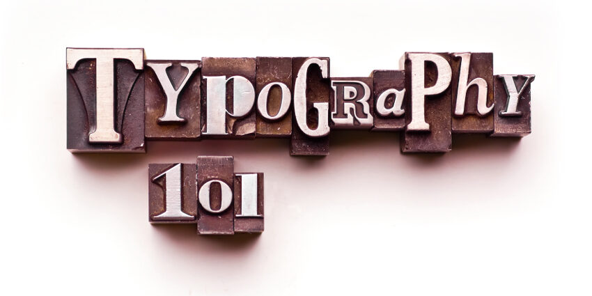
If I had to pick one graphic discipline to rule them all it would be typography. Think of these 26 alphabet characters as individual logos, icons of sound. To work in the media realm, visual information professionals should not overlook the power and pitfalls of typography.
Design attracts a person’s attention. If done properly, it will garner enough time to get the prospective client to read the verbal message. Typography enhances and lives in harmony with the graphic elements. Used incorrectly, the written message can ruin an ad, causing a messy confusion of information with no hierarchy, legibility, impact or aesthetic continuity.

Selecting an appropriate font is crucial. If the font will be used as a design piece it should match the visual theme of the ad. Imagine the 2013 remake of The Great Gatsby using anything other than Art Deco-styled fonts within the geometric frame of the poster and promotional materials. A script font would have ruined an otherwise impactful and beautiful design.
However, if you are using a font for body text of a print ad in a magazine you would want to stray away from fonts intended for large-scale display fonts such as Didot, and stick to a more legible font such as Helvetica which I chose to write this blog in : )
If at all possible avoid from the infinite amount of gimmicky fonts out there – typefaces so garish that they may only work in the most niche of design attempts. Jokerman is the first font that pops in my head.
Keep your font usage in the same font family such as Transitional, Modern, Old Style, etc. That’s not to say you should use just one font, but a cohesive look that unites the font family. Even then, don’t go crazy; a good rule-of-thumb to live by is don’t use more than three fonts.
Contrast creates a natural impact so separating similar elements helps the viewer digest the information and create a visual harmony. Which I’m going to do right now,

Hierarchy needs to be established in all forms of design from billboards to company PowerPoint presentations. Verbal information needs to be presented in order of importance. If someone were to only give your ad a few seconds, thus not reading all of it, what do you want them to understand about your message, product or event?
Ever see one of those ads with bursts of statement all over them “FREE – TODAY – SAVE – LIMITED TIME,” in a kaleidescope of colors selection, fonts, and absolutely no hierarchy. It means nothing. They’ve effectively cheapened their brand by showcasing information in an amateur way.
Because of its importance, I would place typography at the very top of the design totem. I have yet to meet a designer that hasn’t wanted to be a better typographer.
I’ll end with some terms that you will find helpful in streamlining conversations while collaborating on a project. These will help when deciding which font to select for your project.

Typography is the visual language of your design. Ensure that it’s not an afterthought placed haphazardly in available spaces. From a verbal standpoint, messages should be clear and concise and, from a design angle, should work well with your chosen aesthetic.
Good design requires good typography. Share on X
Written by Josh Plueger || Graphic Design Maverick

