Google Analytics is one of the most popular website analysis tools for businesses of all sizes to get a better understanding of their digital customer activity. With a seemingly endless number of data segments to explore in this easy to use and free tool, it can be difficult to know where to start. Here are three Google Analytics reports that bring clarity to the picture of digital customer activity.
Audience-Device Breakdown Data Table
Mobile-friendly web design has grown from a nice addition to an absolute necessity (Read more on the topic here). To understand how you can use this information, let’s look at a hypothetical situation and its data.
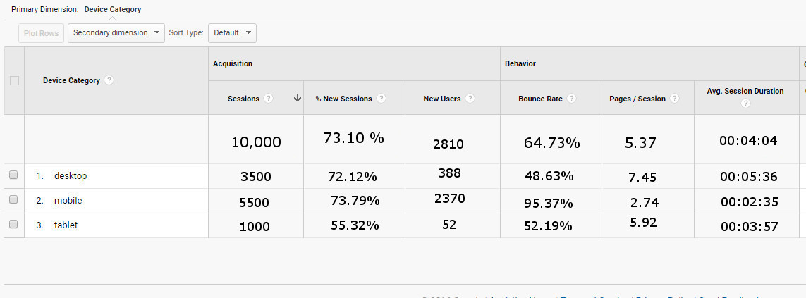
Here is data from a sample website (Find this table for yourself in Google Analytics in the Reporting tab, under Audience > Mobile > Overview).
You can see that the data is broken out into 3 device categories:
• desktop
• mobile
• tablet
We’re going to focus on the number of sessions, bounce rate, pages per session, and average session duration. Check out the first column under Acquisition. From a glance, we can see that mobile sessions make up about half of the total sessions–more than desktop sessions and tablet sessions combined. With this in mind, move to the right and look at the columns under Behavior. Here you can see indicators of engagement–how much a user interacts with your site–namely, bounce rate, pages per session, and average session duration.
Compare the Acquisition and Behavior portions of the table and you may notice that while almost half of all sessions come from users on mobile devices, the bounce rate for this category is much higher than for desktop users or tablet users. Furthermore, pages per session and average session duration is lower than the other device categories.
Together, this data could be an indicator of mobile users not engaging with your content (or not finding what they are looking for), a broken link/page, or complete inaccessibility of the site/page by mobile users. Check out this mobile-friendly test from Google to see if your site is accessible from mobile devices.
Acquisition by Channels Pie Chart & Social Network Data Table
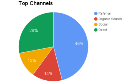
Audience reports provide an opportunity to learn about who visits your site–what device they were using to access it, their geographical location, whether they are a new user, etc.–but Acquisition Reports tell you all about what brought them to your site in the first place. In Google Analytics, acquisition refers to the different ways your site can “acquire” users from outside sources. Clicking into the Overview of the Acquisition data will bring up a page showing a pie chart split into several broad categories. There are an array of channel options, but the four main categories of site traffic are: referral, organic search, social, and direct.

Here is an example of a pie chart from our sample site. It’s clear to see that almost half of the traffic comes from referral links. Direct traffic is about one-third of activity and organic search and social traffic combine to make up the last one-third. If you click into the Social Channel data, you will see a data table listing all of the social networks that have helped to initiate a session.
Here’s a portion of the data table from our sample website.
Here, you can see that even though Facebook brings in roughly 76% of the social traffic, bounce rate is twice as high as the second entry, Twitter, which accounts for only 7.06% of the total sessions. Also, average pages per session and session duration is half as much as Twitter. If you want even more information, you can set up conversion goals. They will help you measure how frequently users perform a specific task that benefits your business or moves towards a goal. A higher conversion rate and/or higher total goal completions are also excellent indicators of the value of each Social Channel. Similar to our mobile example, this information can guide some decision-making. For instance, since Twitter has fewer total sessions but higher engagement statistics and higher conversions/conversion rate, this could be an area of growth or the focus of a social media marketing campaign in the future. Time to plan a Twitter campaign!
The Behavior Flow Report
Here’s an example of a flow report. This particular report can be found in Google Analytics under the Reporting tab. Drop down your behavior report options and click on the second from the top: “behavior flow.” At first glance, all of the colors, lines, numbers, and letters can blend together and quickly become overwhelming. Rather than trying to look at every path users have taken through your site, focus on a single path at a time.
This behavior flow example focuses on landing pages. You can see the different pages that users first came into contact with and follow all of the different paths to see the entire journey through your site. Hover over different portions of the chart to see more specific data concerning the number of sessions that ended with that page and the number of sessions where a user continued to a new page. Clicking one of the green areas will drop down a menu with options to highlight or explore a specific path, or to see more details about that group of sessions. Try clicking on different path lines to focus only on that particular set of pages. The flowchart is a great example of visual representations of information.
The landing pages flow report is only one of many possible ways to explore how users move through your website. Moreover, this report can provide insight into which pages or content keep users the most interested. For example, if you design two unique landing pages for a single marketing campaign, a flow report would help you see which landing page is bringing in the most users and moving users deeper into your website and which pages are followed with a large percentage of drop-offs. In addition to pages, the behavior flow report can also show how users flow from event to event. Like the landing page example, the event flow reports can show you which events move a user to other events or if there’s a large percentage of users dropping off the flow report following an event.
It’s cliche, but I have barely scratched the surface of the endless number of reports you can peruse in Google Analytics. These are just a few of the reports that I have found helpful but by no means is it an exhaustive list. If your business needs some more guidance in Google Analytics, contact us.
Frequently Used Terms in Google Analytics
Click or tap each word to see the definition
The process of isolating particular subsets of your data (known as segments) to better analyze and understand the data.
The users (people) who visit your website
When a user visits your website and stays active on it for some duration of time.
Percentage of sessions where a user lands on a page of your site and leaves from that page without viewing any other content.


